robida & co

Three Robida & Co soda cans in purple, orange, and green flavor variants standing side by side

project overview

robida is a self-initiated packaging project for a fictional slovenian craft soda line, built around blackberry and other foraged flavors. the scope covered everything: brand strategy, visual identity, and a full 330ml can system across three flavors. the challenge: build something that feels handmade and local, not corporate, while still holding up as real, shelf-ready packaging, down to the nutritional panel and barcode.

project type

packaging design

year

2026

my role

brand & packaging designer

client

personal project

process

Early Robida can wrap design with fully saturated color blocks per flavor, before revisions

First pass at the can wrap used one color per flavor across the whole background — too saturated, too busy, and the wordmark got lost in it. Clear sign to rethink the ratio between color and white space before going further.

First pass at the can wrap used one color per flavor across the whole background — too saturated, too busy, and the wordmark got lost in it. Clear sign to rethink the ratio between color and white space before going further.

Second attempt: redrew the wordmark, swapped the saturated background for a lighter palette, replaced the stripe pattern with a repeating diamond motif pulled from the new logo, and gave the fruit illustrations more detail. Enough restraint to let the wordmark breathe, enough pattern to still feel handmade.

Second attempt: redrew the wordmark, swapped the saturated background for a lighter palette, replaced the stripe pattern with a repeating diamond motif pulled from the new logo, and gave the fruit illustrations more detail. Enough restraint to let the wordmark breathe, enough pattern to still feel handmade.

Robida & Co brand identity board showing wordmark, color palette, and typography
Robida & Co pattern and illustration board with a repeating diamond motif and hand-drawn fruit illustrations

Final round tested different can proportions before landing on the right one: comparing wider, shorter formats against the final slim can shape used across the line.

Final round tested different can proportions before landing on the right one: comparing wider, shorter formats against the final slim can shape used across the line.

final product

Flat packaging layout for the Robida & Co 330ml can, showing the back panel with nutrition facts and barcode alongside front label designs for cherry and elderflower flavors
Robida & Co color palette
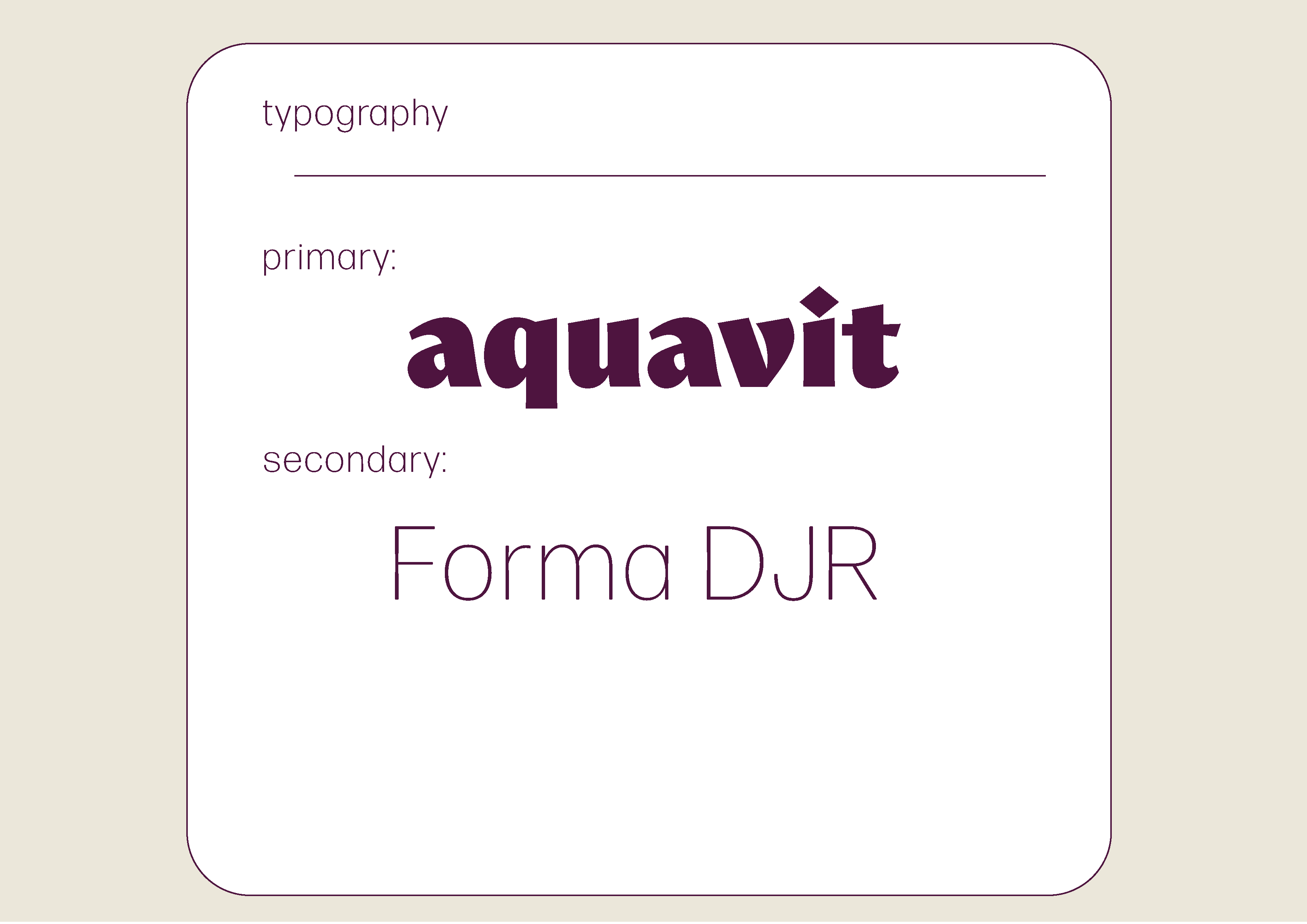
Robida & Co color typography
Close-up angled render of Robida & Co cans in blackberry, cherry, and elderflower flavors, showing the wordmark wrapping around the can
Robida & Co blackberry-flavored can resting in ice, condensation forming on the striped label
Robida & Co cherry-flavored can resting in ice, condensation forming on the striped label
Robida & Co elderflower-flavored can resting in ice, condensation forming on the striped label
Three Robida & Co cans standing side by side showing the front label design for blackberry, cherry, and elderflower flavors
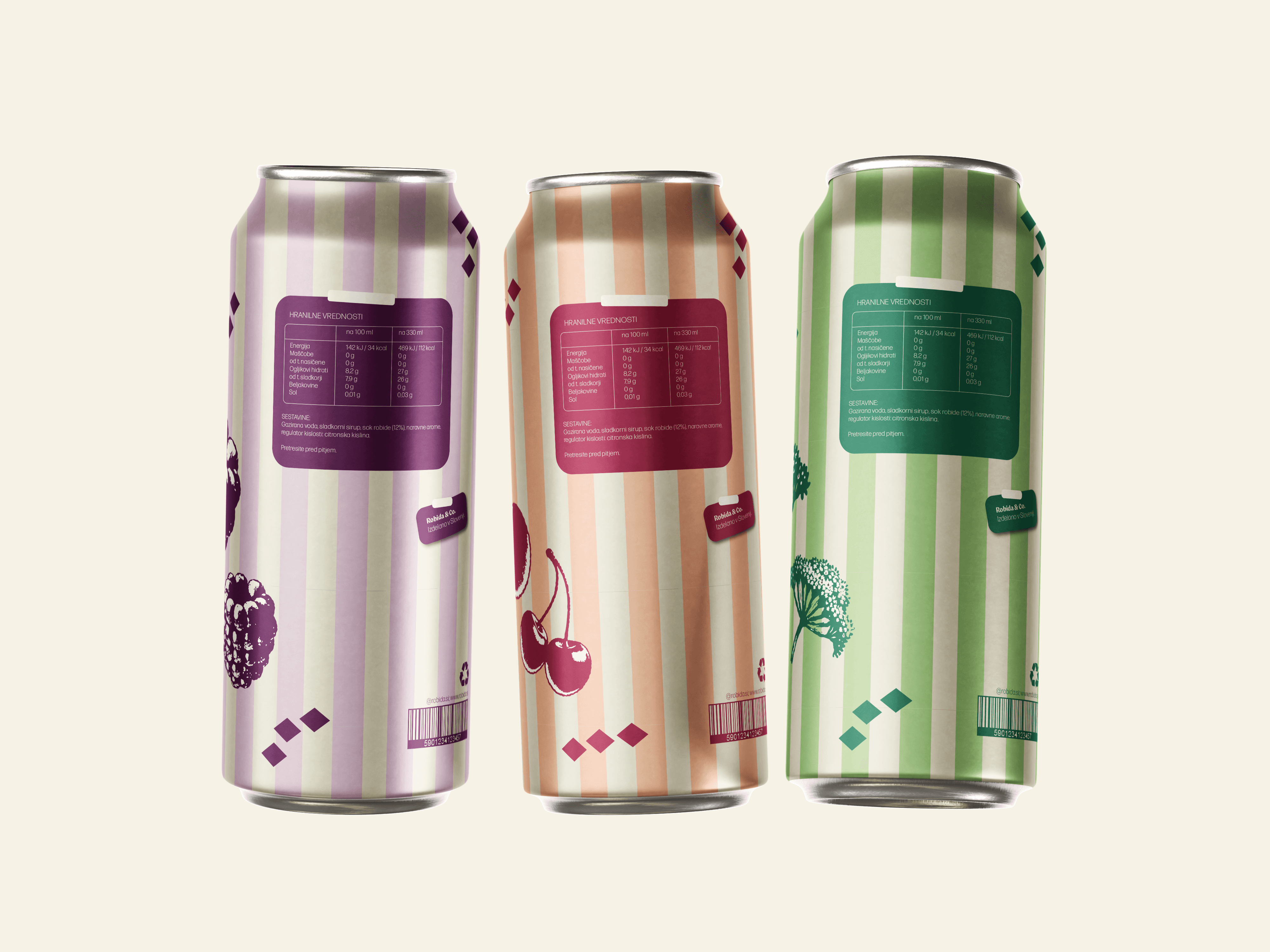
Three Robida & Co cans showing the back label design with nutrition facts, ingredients, and barcode for each flavor